
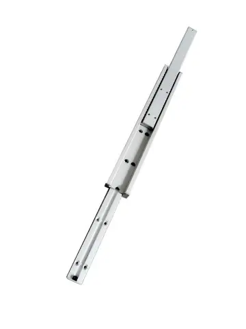
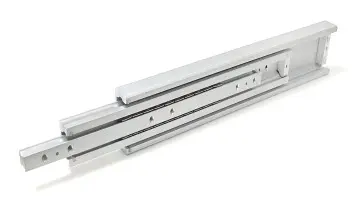



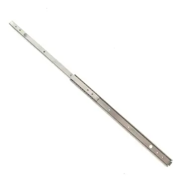
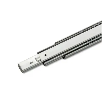
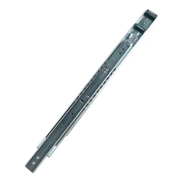



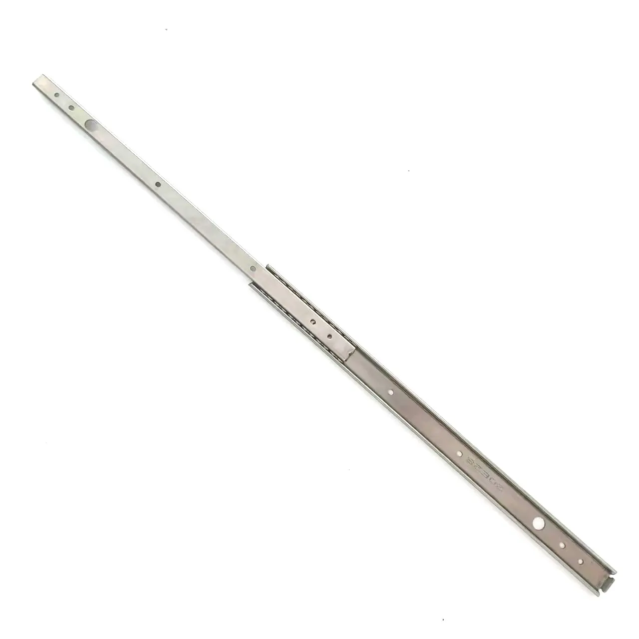

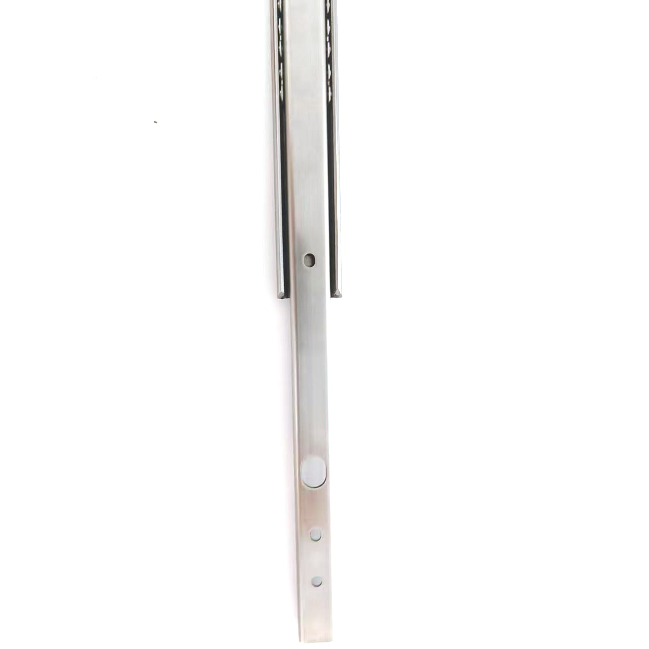
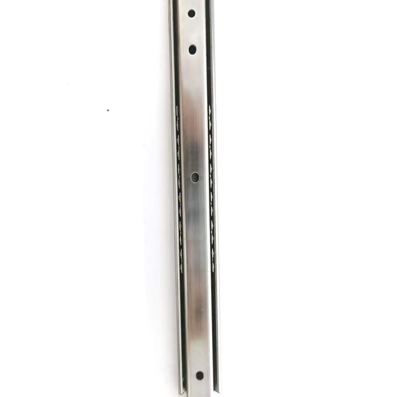
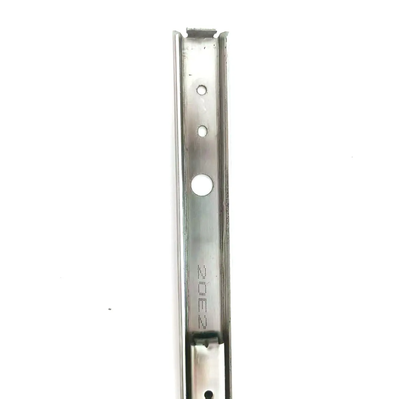
SS1035PT Stainless Steel Slide Rail 35kg Load Capacity - Corrosion-Resistant, Customizable | China Suppliers & Factory
description1
Frequently Asked Questions
What are the key elements of a mobile-friendly web design?
A mobile-friendly design relies on responsive grid layouts, scalable images, touch-friendly navigation, and optimized loading speeds to ensure a seamless user experience across all screen sizes.
How does image optimization affect Google SEO rankings?
Optimizing images reduces page load times, which is a direct ranking factor for Google. Properly formatted images with descriptive alt text also improve accessibility and visibility in Google Image Search.
Why should I avoid using global CSS styles in embedded HTML?
Global CSS styles can conflict with the existing styling of your hosting platform or CMS. Using scoped, prefixed classes ensures that your custom formatting remains intact without disrupting the rest of the website.
What is the best way to display multiple images responsively?
Using CSS Grid or Flexbox allows images to automatically wrap and resize based on the screen width. Setting a maximum width for single images prevents them from stretching and losing quality on desktop views.
How does Structured Data (Schema) benefit my web pages?
Schema markup helps search engines better understand your content structure. Implementing FAQ schema, for example, enables search engines to display rich snippets directly in search results, increasing your click-through rates.